
Brand colours that pass contrast checks without losing your brand
The WCAG 2.1 AA contrast ratios your brand colours must meet for text, buttons and icons, how to test them and how to adjust the palette.
- Nº
- 43
- Published
- Read
- 12 min
- Category
- Notes
- Written by
- Revylio
Brand colours that pass contrast checks: the short answer
Brand colours that pass contrast checks are colour pairs, not single colours. Under WCAG 2.1 AA, text needs a contrast ratio of at least 4.5:1 against its background, and large text needs 3:1. Buttons, form borders, icons and focus indicators need 3:1 against adjacent colours. You keep the brand by giving each shade a job it can pass.
A contrast ratio is the measured difference in luminance between two colours, on a scale from 1:1 to 21:1. The W3C defines it as (L1 + 0.05) / (L2 + 0.05). L1 is the relative luminance of the lighter colour and L2 that of the darker. Relative luminance is the brightness of a colour on a scale from 0 for darkest black to 1 for lightest white.
WCAG 2.1 (the Web Content Accessibility Guidelines, version 2.1, published by the W3C) sets these ratios in two success criteria. Criterion 1.4.3 Contrast (Minimum) covers text. Criterion 1.4.11 Non-text Contrast covers interface controls and meaningful graphics. Both sit at Level AA, the level most business websites work to.
The rest of this guide covers what each criterion asks for and what is exempt. It then shows how to test a palette, works through an example with real colour codes, and explains how to adjust the colours so the site still looks like yours.
Text contrast under WCAG 2.1 AA: 4.5:1 for body text, 3:1 for large text
WCAG 2.1 success criterion 1.4.3 requires text and images of text to have a contrast ratio of at least 4.5:1 against the background. Large-scale text needs only 3:1. The W3C treats text as large-scale when it is at least 18 point, or at least 14 point and bold.
Web designers work in CSS pixels, not points. The W3C gives the conversion as 1pt = 1.333px. That makes 18pt roughly 24px and 14pt roughly 18.5px. In practice, a heading set at 24px or larger, or at about 18.5px and bold, can use the lower 3:1 ratio. Body copy, captions, form labels and footer links at normal sizes need 4.5:1.
The 4.5:1 figure has a reason behind it. The W3C chose it because it compensates for the loss in contrast sensitivity that comes with vision of about 20/40. The W3C also notes that 20/40 is commonly reported as typical for people at roughly age 80. Level AAA, the stricter level, asks for 7:1.
Criterion 1.4.3 reaches further than the main body text. The W3C states that it applies to:
- placeholder text inside form fields;
- text that appears when a pointer hovers over an object;
- text that appears when an object has keyboard focus.
Brand guidelines do not change any of this. The W3C says plainly that text with insufficient contrast because of corporate identity or brand guidelines is not exempt, beyond logos and logotypes.
Contrast for buttons, form fields, icons and focus indicators: 3:1
WCAG 2.1 success criterion 1.4.11 Non-text Contrast requires user interface components and graphical objects to have a contrast ratio of at least 3:1 against adjacent colours. Its aim, in the W3C's words, is that controls and meaningful graphics are distinguishable by people with moderately low vision.
Three terms decide what the rule covers:
- User interface components are the controls a visitor needs to see to use the page, such as a checkbox, a text input or a button.
- Graphical objects are stand-alone icons, such as a print icon with no text, and the important parts of a complex graphic, such as each line in a chart.
- Adjacent colours are the colours right next to the component. For a white input with a dark border on a white page, the border is measured against the white around it.
Focus indicators need special care. A focus indicator is the visible outline or change that shows which element the keyboard is on. The W3C says a control still needs a sufficiently contrasting focus indication, even where it needs no visible boundary. The browser's default focus style is exempt only if you leave it unchanged, and it must still be visible.
The same rule applies to icons placed over images, such as the play button on a video placeholder. The guide to adding video with placeholders, captions and consent covers how those placeholders are built.
What contrast rules exempt: logos, inactive controls and pure decoration
WCAG 2.1 exempts a small, specific set of things from contrast requirements. Knowing the exact list stops a team from either over-correcting the logo or wrongly excusing the website. The W3C names these exemptions:
- Logos and brand names. Text that is part of a logo or brand name has no contrast requirement. The W3C assumes logos follow stricter colour choices set by corporate identity guidelines.
- Inactive components. A control that is visible but not currently operable, such as a disabled HTML control, does not need to meet contrast requirements.
- Pure decoration. Pure decoration means anything that serves only an aesthetic purpose, provides no information and has no function.
- Essential graphics. Flags, photos of real scenes and heat maps are exempt where there is no way to show them with more contrast without changing their meaning.
The logo exemption has a limit. The W3C treats it as covering the mark itself, not a low-contrast presentation the designer chose for the page. More importantly, the exemption stops at the logo. Your brand colour in the logo is free. The same colour used for a navigation link, a button label or a form border is held to 4.5:1 or 3:1 like any other colour.
Hover effects get some latitude too. The W3C treats author-supplied hover treatments as supplemental, so they do not themselves need to contrast 3:1 against the background. Any text that appears on hover still needs to meet the text criterion.
How a contrast ratio is calculated, and why 4.499:1 fails
A contrast ratio compares the relative luminance of two colours using the formula (L1 + 0.05) / (L2 + 0.05), where L1 is the lighter colour. Identical colours give 1:1. The maximum is 21:1. You never need to do the arithmetic by hand, because every contrast checker applies the formula for you.
What matters is how the result is compared with the threshold. The W3C says computed values must not be rounded. A pair that measures 4.499:1 does not meet 4.5:1, and 2.999:1 does not meet 3:1. A checker that displays "4.5" may be showing you a rounded number, so look at the full value or at the tool's pass or fail verdict.
Small differences in calculation can matter at the edge. The W3C changed one constant in the relative luminance definition in May 2021, from 0.03928 to 0.04045. For pairs that sit right on a threshold, choose a shade with some margin rather than one that passes by a hair.
Contrast also depends on both colours being set. The W3C lists failure F24: specifying foreground colours without background colours, or the reverse. If your stylesheet sets dark grey text but leaves the background to the browser or a user setting, you cannot know the ratio. Set both colours together for every text style and component.
Testing brand colours: check every pair in every state
Testing brand colours means measuring each foreground against each background it actually appears on, in each state. A palette of five colours produces many pairs, and only some of them occur on the site. List the real pairs first, then measure them.
For each pair, record the state it appears in:
- default text and links on each background colour;
- placeholder text inside form fields;
- text that appears on hover or keyboard focus;
- button fills and input borders against the page around them;
- focus indicators against the colour next to them;
- icons and chart lines against their background.
For single pairs, a contrast checker gives you the ratio in seconds. Choose one that shows the full, unrounded value or a clear pass or fail verdict against 4.5:1 and 3:1.
Automated scans miss pairs that only appear on hover or focus, so manual checks still count. The guide to testing website accessibility with tools and manual checks sets out the full method.
Worked example: auditing a palette of yellow, purple and greys
A worked example shows how a palette audit reads in practice. Imagine a brand with a bright yellow (#FFF000), a strong purple (#6221EA) and three greys (#E5E5E5, #9D9D9D and #6E747B), on a white site. Every ratio below comes from the W3C's own examples for criterion 1.4.11.
| Pair | Ratio | Normal text (4.5:1) | Large text and controls (3:1) |
|---|---|---|---|
| Yellow #FFF000 on white | 1.2:1 | Fails | Fails |
| Grey #9D9D9D on white | 2.7:1 | Fails | Fails |
| Light grey #E5E5E5 on purple #6221EA | 5.6:1 | Passes | Passes |
| White on slate grey #6E747B | 4.7:1 | Passes, narrowly | Passes |
The audit gives each colour a clear role. The yellow cannot carry text or a control border on white at all. It can stay in the logo, which is exempt, and in decoration that carries no information. The mid grey #9D9D9D fails as a checkbox border, which is exactly the W3C's failing example, so form borders need a darker grey.
The purple is the workhorse. Light grey or white text on a purple button passes for body-size text, so the purple can fill buttons and banners. White on slate grey also passes, but with little margin, so keep that pair for short labels and test it again after any tweak. The W3C's other examples warn against pale focus rings: grey #AAA on white measures 2.3:1 and #CCC on white 1.6:1, and both fail.
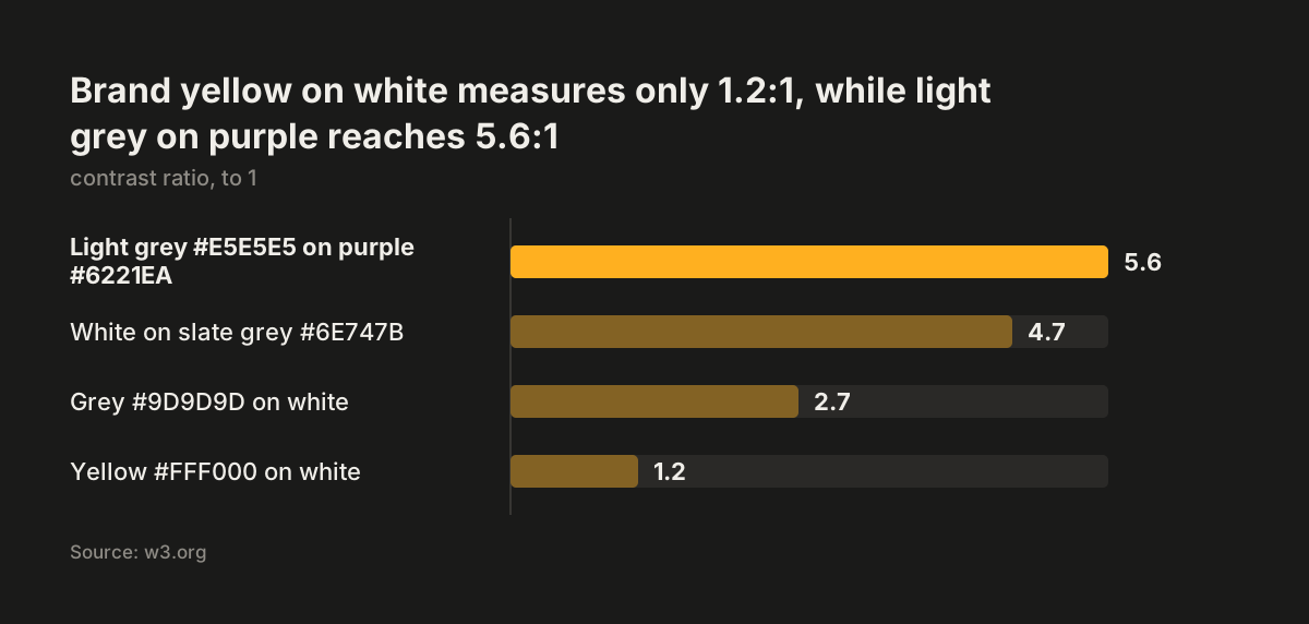
Source: w3.org
Adjusting a brand palette without losing the brand
Adjusting a palette for contrast works best when you change roles, not identity. A visitor recognises your brand from the logo, the dominant hue and the layout. Few notice whether link text is one shade darker than the logo colour.
These moves keep the brand while meeting WCAG 2.1 AA:
- Leave the logo alone. Logos are exempt, so the master brand colour can stay exactly as specified there.
- Add a text shade. Create a darker version of the main hue for links and small text, and test it against every background.
- Use the large-text allowance. Headings of about 24px, or about 18.5px bold, need only 3:1, so a mid-tone brand colour may work there when it fails for body copy.
- Put the brand colour behind text. A strong fill with light text, like the purple button in the worked example, keeps the colour prominent.
- Use bright accents on hover. Hover treatments are supplemental, so a bright accent can appear there as long as the default state already passes.
- Never rely on colour alone. WCAG 2.1 has a separate criterion, 1.4.1 Use of Color, so pair colour with text or an icon.
When we at Svennis rework a palette for a redesign, we keep the logo and main hue untouched and add one darker text shade and one border shade, each tested against every background it sits on. The failures we find most often are not in the brand book at all: placeholder text, focus rings and pale form borders that someone added later.
Calls to action deserve first attention, because they are both brand colour and control. The guide to writing service pages that bring enquiries covers where those buttons belong.
Contrast checklist: which colour pairs need which ratio
A contrast checklist turns the two WCAG 2.1 AA criteria into a list of elements and minimum ratios you can test against. Use the table below when you review a design file or a live page. Each row names an element, the criterion that covers it and the minimum ratio, with no rounding.
| Element | Criterion | Minimum ratio | Note |
|---|---|---|---|
| Body text, links, labels | 1.4.3 | 4.5:1 | Brand guidelines give no exemption |
| Large text (about 24px, or 18.5px bold) | 1.4.3 | 3:1 | 18pt, or 14pt bold |
| Placeholder text in form fields | 1.4.3 | 4.5:1 | Often missed |
| Text shown on hover or focus | 1.4.3 | 4.5:1 | Test in that state |
| Button and input boundaries | 1.4.11 | 3:1 | Against adjacent colours |
| Icons without text, chart lines | 1.4.11 | 3:1 | Graphical objects |
| Custom focus indicator | 1.4.11 | 3:1 | Browser default exempt only if unchanged |
| Logo and brand name | Exempt | None | The mark only, not the site |
| Disabled controls, pure decoration | Exempt | None | Must carry no information |
Charts and results graphics need extra care. The W3C notes that infographics often fail several AA criteria at once, including 1.4.1 Use of Color and 1.4.3 Contrast (Minimum). If your site shows client results as charts, the guide to case study pages that win new clients covers how to present them.
What the European Accessibility Act means for your brand colours
The European Accessibility Act makes accessibility a legal requirement for the businesses it covers. That includes UK businesses that sell covered products or services into the EU. In the UK itself, the Equality Act 2010 requires service providers to make reasonable adjustments for disabled people. The Equality Act names no technical standard. WCAG 2.1 AA is the benchmark most UK organisations use to judge whether a website is accessible.
For services the European Accessibility Act covers, such as online shops, the usual reference point is the European standard EN 301 549, which includes WCAG 2.1 AA. In practice, your site should meet criteria 1.4.3 and 1.4.11, whatever the brand book says. Under the European Accessibility Act, microenterprises that provide services are exempt. A microenterprise has fewer than 10 staff and a turnover or balance sheet of no more than 2 million euros. The Equality Act 2010 has no small-business exemption.
The W3C leaves no room for a brand argument. Beyond logos and logotypes, text with insufficient contrast because of corporate identity or brand guidelines is not exempt. A pale grey body text chosen because it "feels premium" is a failure, not a style decision.
Contrast is also among the easiest failures for anyone to find. Free checkers measure a pair in seconds. A customer, a competitor or an auditor needs no specialist skill to spot a failing palette.
The people affected are often your own customers. The W3C set 4.5:1 to compensate for the contrast loss that comes with 20/40 vision, which it describes as typical at roughly age 80. Check with your legal adviser whether the European Accessibility Act covers your products and services. The colour work is the same either way.
Next steps: test your palette and update the brand guidelines
The next step is a short palette audit you can run this week, before any redesign starts. It needs your brand guidelines, the colour codes from your stylesheet and a free contrast checker.
- List the real pairs. Write down every text colour and the backgrounds it appears on, plus button fills, input borders, icons and focus styles.
- Measure each pair. Record the full ratio, unrounded, and mark it against 4.5:1 or 3:1 using the checklist above.
- Check the states. Look at placeholder text, hover text and keyboard focus on a live page, not only in the design file.
- Assign roles. Keep the logo colour as it is, and add a darker text shade and a border shade where pairs fail.
- Write it down. Add a web section to the brand guidelines listing the approved pairs, so new pages and campaigns stay compliant.
- Retest after changes. Any new colour or template means new pairs to measure.
Contrast is one check among many. For the full set of automated and manual checks, including keyboard and screen reader testing, follow the guide to testing website accessibility for WCAG 2.1 AA.