
Contact forms people actually complete and how to design one
Fewer fields, clear labels, helpful errors and the right input types: how to design a contact form more visitors finish and assistive technology can use.
- Nº
- 30
- Published
- Read
- 10 min
- Category
- Notes
- Written by
- Revylio
Contact forms people actually complete are short, labelled and forgiving
Contact forms people actually complete do four things. They ask only for what you need to reply, label every field, explain errors in plain words, and work with the visitor's keyboard and autofill. The W3C forms tutorial states the risk directly: if irrelevant or excessive data is requested, users are more likely to abandon the form.
Form friction is anything on a form that slows a visitor down or makes them unsure they will succeed. Common sources include:
- an extra field;
- an error message that does not say what is wrong;
- a label that a screen reader cannot announce;
- a block of legal text above the button.
Each source of friction is avoidable.
Removing friction is not only about conversion. The W3C notes that accessible forms are easier to use for everyone, including people with disabilities. This guide covers which fields to keep, then labels, grouping, error messages, input types, consent and the button. It then walks through one rebuilt quote form, what forms mean for a European business, and the tests to run before and after launch.
Fewer fields: ask only for what you need to reply
Removing fields is the fastest way to get more contact forms completed. The W3C forms tutorial says users usually prefer simple and short forms. Every field you add is one more decision for the visitor, and one more point at which they can give up.
Optional fields deserve particular suspicion. An optional field still adds length to the form. It also asks the visitor to decide whether to answer it at all.
Put one test to every field on the form. Who reads the answer, and what does it change in your reply? If nobody uses the answer before the first conversation, ask the question in that conversation instead. Company size, budget band and "how did you hear about us" are common candidates for removal on a first enquiry.
At Svennis, we start every form review by sitting with the person who answers the enquiries and asking which fields they actually read before replying. Any field they cannot name a use for comes off the form, and the question moves to the first call.
Labels that screen reader, speech input and touch users can all use
Every form control needs a label that is tied to it in the code. The W3C forms tutorial says to use the <label> element to identify each control. Other mechanisms, such as WAI-ARIA or the title attribute, are for specific cases only. Assistive technology is software or hardware that helps people with disabilities use a computer, and it relies on that link between label and field.
The W3C describes three groups who depend on properly associated labels:
- screen reader users, who identify and understand controls more easily when the controls are associated with labels, field sets and other structural elements;
- speech input users, who say a label as a voice command to activate a control or move focus to a field;
- people with limited dexterity, who benefit from large clickable areas that include the label, especially on small radio buttons and checkboxes.
Label wording matters as much as label code. Write each label as the plain question you want answered, such as "Your email address". Keep the label visible while the visitor types.
Grouping related fields and splitting long forms into steps
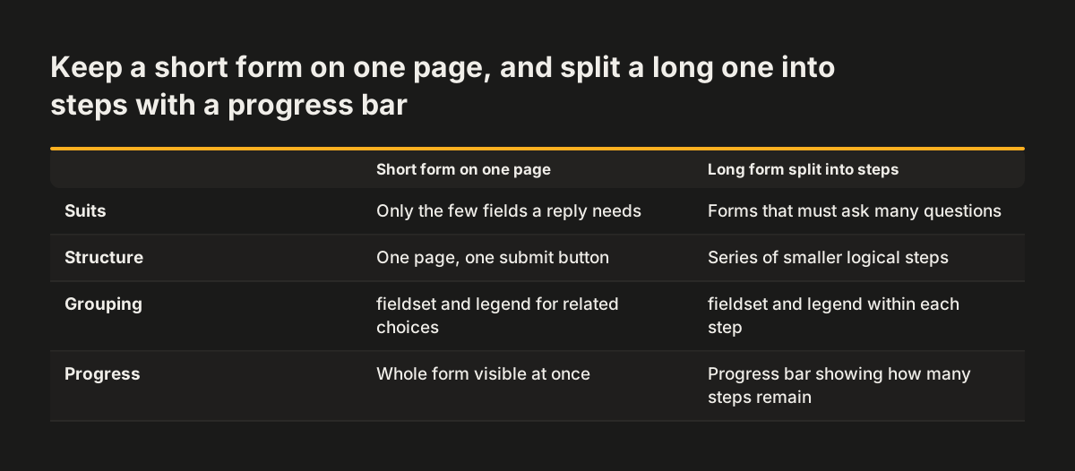
Related fields belong together, both on screen and in the code. The W3C forms tutorial recommends the <fieldset> and <legend> elements to group and associate related controls. A set of radio buttons asking how the visitor prefers to be contacted is a typical example. The W3C notes that screen reader users understand controls more easily when they are associated with field sets.
Long forms need a different fix. The W3C advises dividing a long form into smaller forms that make up a series of logical steps. It also advises telling users about their progress through those steps.
Most contact forms do not need steps, because a good contact form is short enough to take in at a glance. A detailed quote form is the usual exception. If yours runs past a single screen on a phone, split it into steps rather than squeezing the fields closer together.
Error messages that tell visitors how to fix the problem
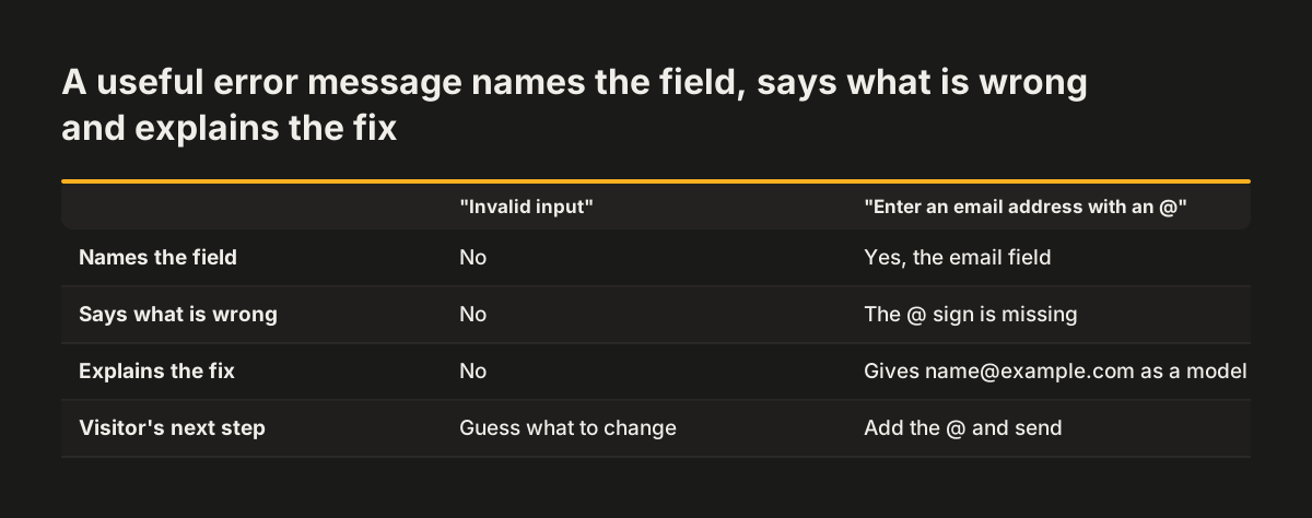
A useful error message names the field, says what is wrong and explains how to fix it. Place the message next to the field it describes. "Invalid input" does none of that. "Enter an email address with an @, such as name@example.com" does all three.
Validation is the check that what someone typed matches what the form expects. web.dev's Learn Forms series includes an article on validating forms on the frontend. Its heading is "Help users enter the right data in forms". The series also explains how form attributes can activate the browser's built-in validation.
Checks on the server need the same care as checks in the browser. The W3C points out that the same accessibility concepts apply to all forms, whether they are processed client-side or server-side. If your server rejects a submission, the message the visitor sees must be just as clear. It must also be tied to the field, like any check in the browser.
Input types, autofill and on-screen keyboards on mobile
The right field settings save the visitor typing. web.dev's Learn Forms series covers form attributes that change the layout of on-screen keyboards and activate built-in validation. The series has a separate article on autofill and the autocomplete attribute. Autofill is the browser feature that offers details the visitor has already saved, such as their name and email address.
For each field on your contact form, check three things:
- the field is set up for the type of data it collects, so a phone shows a keyboard that fits;
- the field carries an
autocompleteattribute, so the browser can offer saved details; - the field accepts the formats real visitors will type.
Test these settings on real devices. web.dev recommends making sure a form works across different devices, browsers, platforms and contexts. A desktop check alone will not show you the keyboard a phone user sees.
Time limits, consent wording and the submit button
Contact forms should not time out. The W3C advises that, if possible, forms should not be subject to a time limit. Where a limit is needed, for example for security reasons, the user should be able to turn it off or extend it. The W3C exempts live events such as auctions or games, which rarely apply to a contact form.
Consent wording is where many forms get heavy. Keep the consent text at the form to one short sentence. Place it next to the button it relates to, and link to your privacy notice for the detail. Our GDPR post on what to check before you relaunch covers what that wording must contain, so this guide does not repeat it.
The submit button should say what happens next. On a contact page, "Send my question" or "Request a quote" tells the visitor what pressing the button does. A generic "Submit" tells them nothing. A visitor who has filled in the fields should never have to hunt for the way to send them.
Worked example: rebuilding a quote request form field by field
Take a quote request form on a small firm's website that asks for ten things before anyone can send it. The example is illustrative, but every change in it follows the guidance in this post. The aim is a form that gives the person answering enquiries enough to reply, and nothing more.
| Field | Before | After | Reason |
|---|---|---|---|
| Name | Title, first name and surname as three required fields | One field labelled "Your name" | Fewer decisions; name formats differ between countries |
| Plain text box, no autofill | Email field with an autocomplete attribute | Fitting keyboard on phones and saved details offered | |
| Phone | Required for everyone | Shown only if the visitor picks phone as their contact method, in a fieldset with a legend | No required field the visitor does not need |
| Company size, budget, source | Three required drop-downs | Removed and asked on the first call | Nobody read them before replying |
| Message | Box with grey placeholder text and no label | Box labelled "What do you need?" using <label> | Usable by screen reader and speech input users |
| Consent | Paragraph of legal text above the form | One sentence next to the button, linking the privacy notice | Less to read at the moment of sending |
| Button | "Submit" | "Request a quote" | Says what happens next |
Notice what did not change. The rebuilt form still collects everything needed for a useful first reply. What disappeared is the work the visitor was doing for the firm's records rather than for their own question.
What contact forms mean for a business website in Europe
Many European businesses take enquiries from more than one country, and their contact forms have to cope with that. web.dev's Learn Forms series advises being prepared for international data formats and planning a form for localisation. Localisation means adapting a form to each language and country it serves. Names, addresses and phone numbers do not follow one pattern, so strict rules built for one country can reject a genuine enquiry from another.
Privacy belongs in the form's design, not only in the footer. web.dev covers making forms secure and keeping users' data private. Asking for less data is the simplest privacy measure available. It also matches the W3C finding that excessive data requests drive people to abandon forms.
Accessibility belongs there too. A contact form is the point where a visitor either reaches you or gives up. Associated labels, grouped controls and clear errors decide whether a disabled visitor can get through. If you are choosing who will build or rebuild your site, our checklist for choosing a web design agency for accessible, compliant business sites lists the questions to ask before you sign.
Testing a contact form before and after launch
A contact form is finished only when real people have used it. web.dev covers usability testing, which means watching people try to complete the form and noting where they hesitate. It also covers testing across different devices, browsers, platforms and contexts.
Run these checks before launch:
- complete the form on a phone and on a desktop browser;
- complete it using only the keyboard, with no mouse;
- submit it with deliberate mistakes and read every error message;
- complete it with a screen reader running and listen to each label.
After launch, change one thing at a time. Alter a single element, such as the button wording, and compare submissions before and after. Changing several things at once hides which one made the difference.
Finally, check what happens after the visitor presses send. A completed form that sits unread in a shared inbox loses the enquiry just as surely as an abandoned one. Our post on connecting website forms to a CRM covers where submissions should go instead.
Next steps for reviewing your own contact form
You can review your current contact form yourself with the checklist below. Work through it in order, because removing fields first makes every later step shorter.
- List every field and name who uses each answer before replying. Remove the fields nobody uses.
- Check that each remaining field has a visible label tied to it with
<label>. - Group related choices, such as contact preference, with
<fieldset>and<legend>. - Submit the form with deliberate mistakes. Rewrite any error message that does not say how to fix the problem.
- Open the form on your phone and check the keyboard, the autofill and the spacing between fields.
- Cut the consent text to one sentence and a link to your privacy notice.
- Rename the button so it says what the visitor gets.
Some forms sit in a template that the current site makes hard to change. When that happens, the problem is usually wider than one page. You can compare your site with examples of business websites we have rebuilt before deciding whether to fix the form in place or plan a larger change.