Best fonts for accessibility and what WCAG 2.1 AA actually requires of website text
WCAG 2.1 AA names no font. See which typefaces accessibility guides recommend, and the size, spacing and contrast rules that make website text readable.
- Nº
- 20
- Published
- Read
- 13 min
- Category
- Notes
- Written by
- Revylio
Best fonts for accessibility: plain typefaces with distinct letters
The best fonts for accessibility are plain, widely available typefaces with letters that are hard to confuse. Sans-serif faces such as Arial, Verdana, Tahoma, Calibri, Helvetica and Roboto top most lists, and Georgia is a serif option designed for screens. The typeface is the smaller decision, though. WCAG 2.1 AA names no font at all.
An accessible font is a typeface whose letters stay distinct and easy to process at normal reading sizes. It serves readers with low vision or dyslexia, and everyone else as well. DELTA News puts it plainly: a highly readable font benefits everyone, and especially people with dyslexia or low vision.
The choice of typeface still has a measurable effect. A discussion on the XWiki forum summarises Adobe research that tested 16 fonts on 352 participants. Adobe found that fonts matter a lot for reading speed. Among high-legibility fonts, the forum also cites a 35% difference in reading speed between the best and the worst.
Even so, a good typeface set too small, too light or too tightly spaced fails your readers anyway. What makes website text readable is the set of rules around the typeface: size, spacing, contrast and how the page behaves when a visitor enlarges the text. Those rules are what WCAG checks.
WCAG 2.1 AA sets rules for text, not a typeface
WCAG 2.1 AA does not prescribe a typeface. One typography guide on accessibility states that its font advice comes from designers and design research rather than official WCAG. The Web Content Accessibility Guidelines, published by the W3C, instead set testable rules for how text behaves.
Four groups of rules matter most for website text:
- Resizing: text can be resized without assistive technology up to 200 percent without loss of content or functionality, listed under level AA.
- Contrast: smaller text needs a contrast ratio of at least 4.5:1 against its background, and large text, meaning 18 point or more, or 14 point or more in bold, needs at least 3:1.
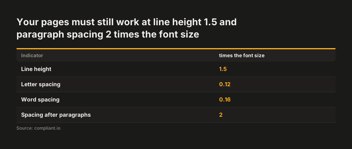
- Text spacing: the page must still work when line height is set to 1.5 times the font size, letter spacing to 0.12 times, word spacing to 0.16 times and paragraph spacing to 2 times.
- Structure: pages carry titles that describe their topic, and link purpose is clear from the link text or its context.
The contrast and spacing values above come from Compliant's summary of WCAG font guidance. None of these rules mentions Arial, Verdana or any other face. A decorative typeface could pass every one of them and still be hard to read, and a classic typeface could fail them through poor sizing.
If your organisation falls under the European Accessibility Act, our guide to the European Accessibility Act and WCAG 2.1 AA for business websites covers scope and the wider checklist. Typography is one part of that checklist, not the whole of it.
Typefaces that accessibility guides keep recommending
Accessibility guides agree on a short list of typefaces, mostly sans-serif faces built for screens. WebAIM and SiteImprove both name Tahoma, Calibri, Helvetica, Arial, Verdana and Times New Roman as the most accessible. Rocket.net reports that Roboto tops most lists. The table shows where each face is recommended and what to watch for.
| Typeface | Style | Recommended by | Note |
|---|---|---|---|
| Arial | Sans-serif | WebAIM, SiteImprove, Penn State | A Windows analogue of Helvetica; the two are generally similar |
| Verdana | Sans-serif | WebAIM, SiteImprove, Penn State | Designed by Microsoft for monitors; many accessibility sites use it |
| Tahoma | Sans-serif | WebAIM, SiteImprove | Made by Microsoft for small on-screen text in boxes and menus |
| Calibri | Sans-serif | WebAIM, SiteImprove | Avoid Calibri Light, which is very thin and can fade into the background |
| Roboto | Sans-serif | Rocket.net, citing most lists | The font Android uses |
| Georgia | Serif | Penn State, Rocket.net | Designed by Microsoft for monitors |
| Rockwell, Arvo, Museo Slab | Slab serif | SiteImprove | Also considered accessible |
Two habits matter as much as the pick. DELTA News calls it good practice to choose widely accessible typefaces over less common ones. Stylistic Design recommends one typeface, or a small number, when you design for accessibility. Penn State adds that decorative and narrow fonts belong in headlines and decorative text only, never in body copy.
Letter shapes to check before you choose a typeface
Letter shapes decide whether a typeface is legible, so check them before you commit. A typography guide on accessibility names imposter letters as the main thing to look for. Imposter letters are letters that are hard to tell apart, most often a capital "I" and a lowercase "l" of similar height.
Rocket.net's guide to accessible fonts makes the same point. Is it a capital "i" or a lowercase "l"? That pairing confuses readers with dyslexia or low vision and neurodivergent readers. The guide's example is a TV station in Corpus Christi, Texas, with the call letters KIII. Set in capitals, your brain may read it as "kill".
Mirror letters and similar rounds
Mirroring is a second risk. Many legible sans-serif fonts use letters that are mirror images of each other, such as "b", "d", "p" and "q". That matters for early readers and people with learning disabilities. The same guide warns that "a", "e", "o" and "c" can look very similar when a typeface builds them from the same modules.
Unusual forms and thin strokes
Unusual letterforms cause trouble too. Penn State notes that some readers find the "g" and "&" in Trebuchet MS too unusual, especially where literacy is an issue.
A quick test helps. Type a line such as "Ill bdpq aeoc" in each candidate typeface at body size. Read it on a phone and a laptop. If you hesitate over any letter, so will your visitors.
Dyslexia fonts and hyperlegible fonts, and when to use them
Specialist fonts exist for particular readers, but a good default face suits most websites better. Compliant names Dyslexie and OpenDyslexic as fonts made for people with dyslexia. Stylistic Design explains that letters in such typefaces can be slanted, can have thicker lines in places, and can give "b", "d" and "p" sticks and tails of different lengths.
Atkinson Hyperlegible takes a different route. The Braille Institute and Applied Design Works designed it, and it is named after the Braille Institute's founder. It keeps a traditional grotesque sans-serif at its core and adds distinctive elements to improve character recognition for readers with low vision. Andika, a free sans-serif from SIL, was designed for beginning readers and may also suit some readers with reading disorders.
Check the licence first
Licensing can rule out a specialist font for a business site. APHont, from the American Printing House for the Blind, is free for non-commercial purposes only. A participant on the XWiki forum regretted that Tiresias Screenfont is not open-source.
A strong default beats a font picker
Letting visitors pick their own font sounds generous, but it does not replace a sound default. The same XWiki discussion cites Adobe research showing that people do not always choose the most readable text for themselves. XWiki's own extra accessibility options are narrow: increase text size and underline links. A legible default, plus text that resizes cleanly, does more work than a menu of fonts.
Text size minimums and the 200 percent resize test
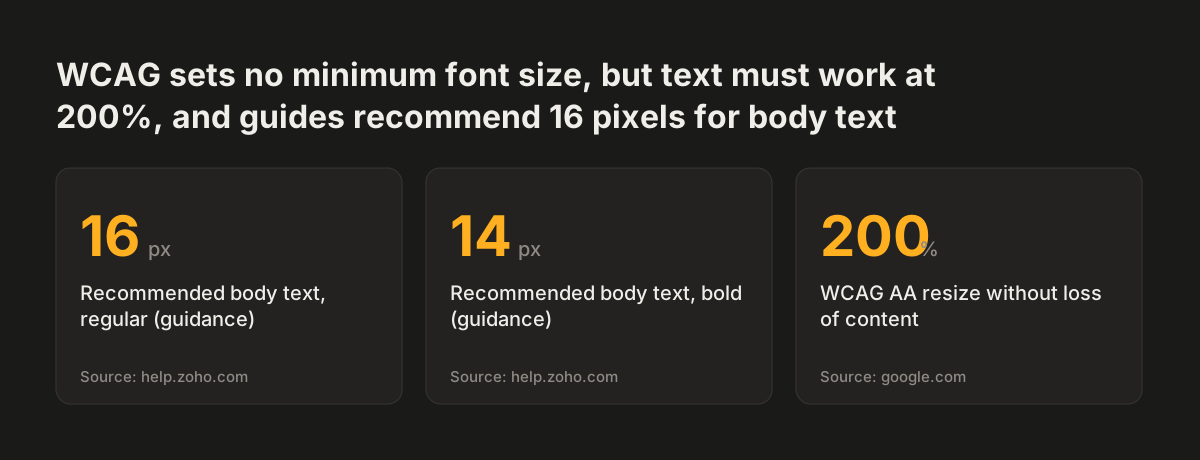
Body text on a website should sit at around 16 pixels and must survive being enlarged to 200 percent. Compliant gives 12-point, 14-point or 16 pixels as the most accessible body sizes. A typography guide on accessibility advises against anything below 13pt. It adds that most users cannot read text below 12 or 13pt, though the exact limit depends on the font's design.
Size helps more than any font swap. Stylistic Design notes that enlarging text often makes letters appear more distinct. The XWiki forum cites Adobe's finding that people read 11% slower for every 20 years they age. Small text costs your older visitors time on every page they read.
For print, the guidance on font legibility for visually impaired readers treats 11 to 12 point as standard print and 16 point as the minimum for large print. A website cannot offer one fixed size for everyone. It must let each reader make text larger without breaking the page.
That is why the 200 percent rule matters most. At level AA, a visitor must be able to resize text to 200 percent, without assistive technology, and lose neither content nor function. In practice the failures are physical. Text overlaps other text, spills out of a button or banner, or disappears behind a fixed header.
A sound typeface choice does nothing to prevent these failures. Your layout does.
Source: help.zoho.com, google.com
Spacing, line length and alignment keep text readable
Spacing between letters, words and lines is one of the main factors in readability, alongside letter shape and size. DELTA News lists the space between letters and lines as one of the things that make text readable. WCAG turns that into a test: your pages must keep working when a visitor raises the spacing.
Compliant lists the WCAG text spacing values a page must tolerate:
- Line height of at least 1.5 times the font size.
- Letter spacing of at least 0.12 times the font size.
- Word spacing of at least 0.16 times the font size.
- Spacing after paragraphs of at least 2 times the font size.
Building those values into your default styles avoids most problems. If line height already sits at 1.5, a visitor's own spacing settings rarely push text out of its containers.
Line length and alignment
The stricter AAA level adds more rules for blocks of text. Among them, lines run no wider than 80 characters, text is not justified, and line spacing is at least 1.5. Many sites apply these at AA too, because they cost nothing once set.
Alignment follows the same logic. The guide for visually impaired readers calls left alignment the most accessible and reader-friendly choice, and says to avoid fully justified text. It also recommends 1.5 line spacing over single spacing wherever possible.
Source: compliant.io
Contrast, colour and font weight decide whether text is visible
Contrast and font weight decide whether readers can see the text at all, whatever the typeface. WCAG, as Compliant summarises it, asks for a contrast ratio of at least 4.5:1 for smaller text. Large text, meaning 18 point or more, or 14 point or more in bold, needs at least 3:1. Pale grey body text on white is the commonest failure on business sites.
Font weight interacts with contrast. Rocket.net cites Stanford University's advice to avoid very light font faces with thin lines, especially at small sizes. Stanford recommends regular weight for most text.
Penn State's font face guidance gives an example. Calibri Light is very thin and can fade into the background, especially when it is not black or white. A colour pair that passes a contrast checker can still look faint in a hairline weight.
Colour as meaning
Colour must never carry meaning on its own. The guide for visually impaired readers states that information should never rely solely on colour. A red error message also needs words that say what went wrong. Compliant advises against red and green, or blue and yellow, as text and background pairs.
Busy backgrounds
Backgrounds behind text should stay quiet. Stylistic Design recommends avoiding visual clutter, such as complex backgrounds or conflicting colour palettes. Text laid over a photograph often passes contrast at one point and fails a few pixels away.
Capitals, bold and italics can undo a good font
Formatting choices in your content can undo a well-chosen typeface. The guide for visually impaired readers states that text in all caps is much harder to read than text in sentence case. Capitals remove the varied word shapes that readers rely on.
Screen readers add a second problem. Rocket.net notes that screen readers read words in all caps as acronyms, and treat emoji in text the same way. A heading set in capital letters in the content, rather than styled to look that way, may be read out letter by letter. If your design calls for capitals, style them rather than typing them.
Emphasis that screen readers miss
Bold does not carry over to audio. Rocket.net also notes that screen readers do not read bold text as bold, so the emphasis is lost. If a warning matters, say it in the words themselves, not only in the weight.
Italics and decorative faces
Italics slow readers down. Stylistic Design reports that italic typefaces make text harder to interpret for people with dyslexia, while sans-serif, monospaced and roman fonts help. Penn State says the italic slant of Monotype Corsiva can slow reading, and that very ornate letterforms, as in Harrington, do the same. Keep italics for short phrases, such as a title or a single term.
These habits live in your content, not your stylesheet, so they need rules your editors can follow. Our guide to writing accessible content that stays accessible after launch covers the editorial side.
A website redesign is the time to set typography rules once
A redesign is the cheapest moment to fix typography, because every template is being rebuilt anyway. Fixing size, spacing and contrast page by page on a live site costs far more than setting them once in shared styles. Our website redesign service treats typography as part of the accessibility work, not as decoration.
At Svennis we write the type rules into the design system before any page template exists: body size, line height, maximum line width, weights and approved colour pairs, each checked against WCAG. Where we see it go wrong is a component with a fixed height, such as a button or a banner, that clips its text once a visitor enlarges it.
Your website font does not have to match your print font
Your brand font and your website body font can differ. Rocket.net notes that Tiffany & Co.'s branding used different fonts for packaging, three-dimensional store signage and etched glass signage. Penn State says that documents meant mainly for print can use other font options. A distinctive brand face can stay in your logo and headlines while a legible face carries the body text.
Put the rules in writing before the designer starts. A website brief template for a redesign gives you a place to state the minimum body size, the spacing values and the contrast targets. You then test each template against those rules, not against taste.
Next steps for checking the text on your own website
You can check the typography on your current site in an afternoon, before you decide on a redesign. Work through these steps in order:
- List the typefaces, weights and sizes your site uses. More than two typefaces, or body text below 16 pixels, is the first thing to fix.
- Type a test line with "I", "l", "b", "d", "p" and "q" in your body font, and check that every letter is distinct.
- Zoom your browser to 200 percent on your key pages and look for clipped, overlapping or hidden text.
- Run your text and background colours through a contrast checker against 4.5:1 for body text and 3:1 for large text.
- Apply the WCAG text spacing values and confirm nothing breaks.
- Search your content for text typed in capitals, long italic passages and justified paragraphs.
Our guide to testing website accessibility with tools and manual checks shows how to run the zoom, contrast and spacing tests properly. Record what you find and what you fixed. That record feeds directly into your accessibility statement, if you publish one, where you tell visitors which parts of the site meet the WCAG standard that applies to you and which do not yet. Most UK public sector bodies must publish an accessibility statement based on the official model statement. Government guidance now expects them to test against WCAG 2.2 AA.
Sources
- Alaïs de Saint Louvent: Typefaces
- Compliant: Accessible fonts, which ones you should choose
- DELTA News: Choosing an Accessible Font
- Accessibility at Penn State: Font Face
- Rocket.net: Website Accessibility, Choosing the Most Accessible Fonts
- Stylistic Design: Accessible Fonts, What Are They And Why Are They Important?
- Font Legibility for Students who are Blind or Visually Impaired
- XWiki Forum: Accessible Fonts, Typography