Writing accessible content for your website so it stays accessible after launch
How editors keep a website accessible after launch: headings, link text, alt text, plain language, forms and documents, with a checklist.
- Nº
- 18
- Published
- Read
- 13 min
- Category
- Notes
- Written by
- Revylio
Writing accessible content keeps a website accessible after launch
Writing accessible content for your website comes down to a few habits that every editor applies to every page. Use real headings in order. Write link text that makes sense alone. Give images alt text that says what they show and do, and write in plain language.
Publish documents in a form people can open. A site that passed WCAG 2.1 AA at launch stays accessible only while those habits hold.
Accessible content is content written so that everyone can understand what the writer is trying to say. Accessibility Made Easy describes it as covering three things: the language you use, the way you format text, and the layout. The Web Content Accessibility Guidelines (WCAG) are the W3C's guidelines for making web content accessible to people with a wide range of disabilities. They come with success criteria written as testable statements.
This guide is for the people who publish on a business site after the developers have gone. Each section covers one habit you can apply in your content management system (CMS) without writing code. A checklist table near the end covers everything on one screen.
Why an accessible website drifts out of compliance once editors publish
An accessible website usually fails through new content, not through its code. The template sets heading styles, colours and focus states once, at launch. Every news post, service page and download after that is written by someone who may never have seen the rules. The Centre for Excellence in Universal Design makes the point that correctly coded, well-structured digital content is wholly dependent on excellent written content.
Volume makes the drift worse. AbilityNet warns that adding new copy all the time can make a website confusing and outdated. A smaller business can respond simply: review what you already have before you add more.
The audience you lose is not small. AbilityNet reports that nearly 14% of the UK population has a disability, from sight loss to dyslexia, memory loss or autism. The same source puts the average UK reading age at about nine.
When Svennis hands a redesigned site over to a client team, we sit with the editors in their own CMS and show them the heading, link and alt text fields on a real page, then leave them the same checklist we used at launch. The pages we later find failing are typically the ones published by someone who never had that walkthrough.
Headings: use real heading styles and never skip a level
Headings give a page a structure that screen reader users can move through. A screen reader is software that reads text out loud for people who are visually impaired. Little Forest notes that these users seldom use a mouse or touchpad and rely on a keyboard instead. Many of them jump from heading to heading to find what they need.
That only works when the headings are real headings. Bold text in a larger font looks like a heading but is invisible to the software. In your CMS, pick the heading style from the formatting menu.
Three heading rules to follow on every page
- One main heading (H1) per page, normally the page title.
- No skipped levels: Little Forest says to put an H3 only under an H2.
- Headings that describe the content below them, so a list of headings reads like a summary.
Cumberland Council's content checklist points out that people tend to scan web pages, and it advises one user need per page. If a page grows very long, split it into separate pages and link them together. The same structure helps machines read your pages, as our post on how AI assistants read your website explains.
Link text has to make sense when read on its own
Descriptive link text tells a reader where a link goes without the sentence around it. Screen reader users often call up a list of every link on a page and choose from that list. A page with five links reading "click here" gives them five identical choices.
Little Forest's guidance is to write purposeful link text that makes sense when read out of context, and never "Read More" or "Click Here". Accessibility Made Easy gives the same advice. The fix is usually to move the link onto the words that name the destination.
Before and after
- Weak: "To see our service areas, click here."
- Better: "We cover the service areas listed on our coverage page."
- Weak: "Download our brochure here (PDF)."
- Better: "Download the 2025 product brochure", with the file type stated next to it.
Keep link text short and specific, and avoid linking whole sentences. If a link opens a document rather than a web page, say so in the link or right beside it.
Alt text: describe what an image shows and does, or mark it decorative
Alt text is a short description of an image that assistive technology reads aloud in place of the image. Little Forest defines it as text that describes the content and function of the image while taking the context into account. A photo used as a link to your contact page needs alt text that names the contact page, not a description of the photo.
Little Forest advises keeping alt text brief, under 125 characters. Something like "Engineer checking a boiler pressure gauge" beats "image123.jpg" or "photo of a man".
When an image needs no description
Decorative images do not need alt text, according to the Government Commercial Agency (GCA) style guide. AbilityNet's advice is to mark such an image as decorative in your CMS, or to give it a null alt text. Leaving the field empty by accident is not the same thing in every tool. The GCA notes that in PowerPoint and Google Slides, screen readers will not ignore images with empty alt text fields.
Images that hold information
AbilityNet warns that photos with written words in them, such as quote graphics, are often not accessible at all. Put the words in the page text instead. The GCA adds that most screen readers will not interact with a process map image, so a diagram of steps always needs a text alternative.
Plain language: short sentences, familiar words and abbreviations spelled out
Plain language is the habit that helps the widest group of readers. Cumberland Council recommends writing for a reading age of nine. It says this helps people who find reading difficult and people with English as a second language. Accessibility Made Easy gives the same target.
Be accurate about what WCAG asks here. The Centre for Excellence in Universal Design lists success criterion 3.1.5 Reading Level at level AAA, above AA. Plain language still makes every other criterion work, because a well-structured page full of jargon still fails its readers.
Sentence and word rules from the guidance
- Sentence length: Cumberland Council recommends short sentences of around 25 words.
- Long words: Cumberland Council treats words of four or more syllables as difficult to read.
- Abbreviations: explain them in full the first time on each page, unless they are well known, such as UK.
- Symbols: Accessibility Made Easy advises against ampersands and other symbols in place of words.
- Emphasis: Accessibility Made Easy advises against italics, all capitals and paragraphs of bold.
The GCA notes that some screen readers pronounce "e.g" as "egg". Shorter pages help too: Jack Garfinkel of Scope told AbilityNet that 200 words are likely to be more accessible than 800.
Lists, colour and layout: use the editor's own tools, not visual tricks
Formatting is accessible when the meaning sits in the page structure, not only in how the page looks. AbilityNet advises using the bullet point option in your CMS rather than typing dashes or asterisks. Real list markup lets a screen reader tell where each point starts.
Colour and contrast
Colour must never be the only way you convey meaning. The GCA style guide says that if you took all the colour away from a page, its meaning should still be clear. Business Disability Forum extends this to shape and size. A form that marks errors only in red fails this test.
Text needs a contrast ratio of at least 4.5:1 against its background, as the GCA states. The Centre for Excellence in Universal Design lists this as WCAG 2.1 success criterion 1.4.3 Contrast (Minimum), level AA. Business Disability Forum points to WebAIM's free online tool for checking contrast.
Layout features to avoid
- Accordions that hide content: Cumberland Council says they are hard to navigate.
- Flashing images and GIFs: the GCA says nothing should flash more than 3 times per second, because flashing can trigger seizures.
- Floating text boxes: the GCA notes screen magnifier users find them hard to read, and some assistive technologies cannot read them at all.
Forms and multi-step pages: carefully worded questions and the step in the title
A web form is a series of questions, and its accessibility depends on how those questions are written. The DWP Accessibility Manual observes that digital services often guide users through a complex process with a series of carefully worded questions. It points to the guidance on designing good questions in the GOV.UK Service Manual, a sound model for an enquiry or booking form.
For each question, write a label that says exactly what you need, in your customers' words. Ask only what you will use. If a field is required, say so in words, not only with colour.
Page titles in a multi-step process
Little Forest gives two page title rules that matter for forms. The page name goes before the organisation name. A page that is part of a multi-step process includes the current step, as in its example "Pick the topping (Step 1 of 2)".
Checks that block people
Business Disability Forum gives the example that a blind person could not complete an animated CAPTCHA asking them to select a triangular object. What happens after the form is sent matters as well, and our post on why your contact form should not end in an inbox covers that side.
PDFs, documents and video need an accessible form too
Documents and media are where many otherwise accessible sites fail, because they bypass the page template. The GCA style guide on writing accessible content says PDFs are designed to be printed, not read on screens, and that its writers should not use them. It says to save documents in an open format such as .odt, .ods or .odp.
For most business sites, the simpler fix is to publish the content as a web page. Price lists, terms and guides all read better as HTML, and they inherit the template's headings and contrast. Accessibility Made Easy also suggests providing an easy-read version where possible.
Video and audio
Little Forest advises transcripts for audio-only content such as podcasts, and both transcripts and captions for training videos. It notes that YouTube offers an auto caption feature for most uploaded videos. Treat those captions as a first draft to correct.
Business Disability Forum adds that downloadable transcripts help people with learning disabilities, dyslexia, and hearing and visual impairments.
Worked example and pre-publish checklist for a new service page
The fastest way to keep a site accessible is to check each page against the same list before it goes live. Say your team adds a page called "Boiler servicing". The steps below take one editor through it in the CMS.
- Set the page title to "Boiler servicing | Your company", page name first.
- Use "Boiler servicing" as the only H1. Add H2s such as "What the service includes" and "How to book", with H3s only beneath an H2.
- Replace "click here to book" with a link on the words "book a boiler service".
- Give the engineer photo alt text such as "Engineer checking boiler pressure", and mark the background pattern as decorative.
- Paste the text into the Hemingway App, which Accessibility Made Easy describes as a free tool that flags long sentences and suggests simpler words.
- Run Microsoft Word's readability check from the spellcheck. Accessibility Made Easy suggests aiming for a score of 60 to 70.
- Check any coloured text or button in WebAIM's contrast tool against the 4.5:1 minimum.
The table below turns those steps into a checklist any editor can use on any page.
| Content | The habit | How to check it |
|---|---|---|
| Headings | One H1, no skipped levels, real heading styles | Read the headings alone: do they summarise the page? |
| Link text | Names the destination, never "click here" | Read each link out of context |
| Images | Alt text under 125 characters, or marked decorative | Does the alt text say what the image shows and does? |
| Sentences | Around 25 words at most, plain words | Hemingway App, Word readability score of 60 to 70 |
| Abbreviations | Spelled out on first use on each page | Search the page for capital-letter groups |
| Colour | Never the only signal, contrast at least 4.5:1 | View in greyscale, use WebAIM's contrast tool |
| Forms | Clear labels, step number in the page title | Complete the form with the keyboard only |
| Documents and video | Web page over PDF, transcripts and captions | Is every file also available as page text? |
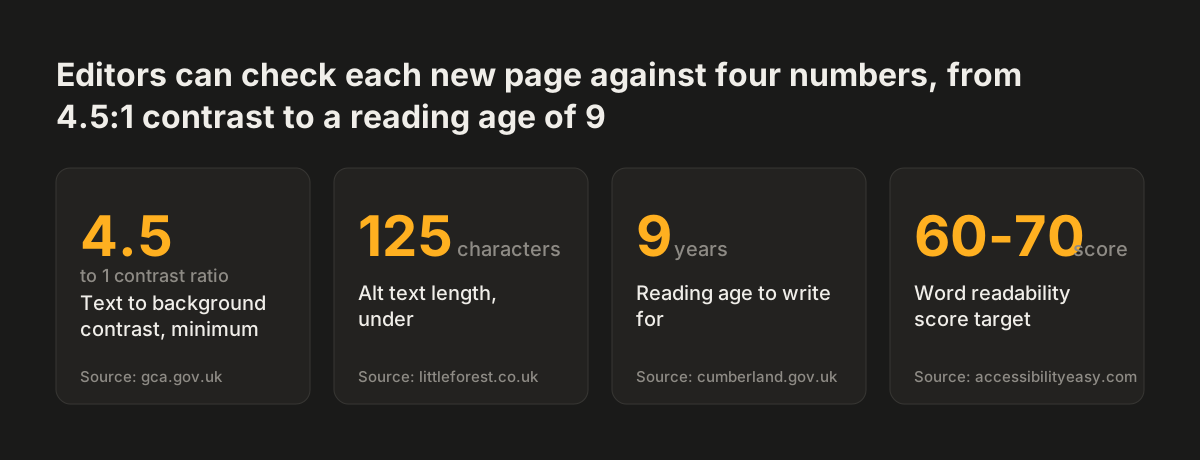
Source: gca.gov.uk, littleforest.co.uk, cumberland.gov.uk, accessibilityeasy.com
What accessible content means for a UK or EU business
Accessible content is a legal matter for a UK business as well as good practice. Business Disability Forum states that making your website accessible is a legal requirement. It warns that a business not applying accessible web design principles could be found to be discriminating against disabled people. The GCA notes that public sector bodies have a legal obligation under the Public Sector Accessibility Regulations 2018, and for them WCAG 2.2 AA is already the standard to meet.
For other businesses, WCAG 2.2 is the version to work to. Business Disability Forum describes WCAG 2.2 as generally viewed as the standard by which all websites should be measured. The European Accessibility Act has applied to in-scope businesses since June 2025. The Centre for Excellence in Universal Design advises organisations subject to the Act or the Web Accessibility Directive to work to WCAG 2.2. Its reason is that the revised EN 301 549 standard that builds on it is expected in the Official Journal of the European Union in December 2026.
The content habits in this guide carry over to that newer version. If you sell into the EU, our post on the European Accessibility Act for business websites sets out what the Act asks of your site as a whole.
Next steps: audit five recent pages and brief every editor
Start with the pages published since launch, because that is where an accessible website drifts first. Pick the five most recent pages or posts and run each through the checklist table above. Note every failure by type. The pattern tells you which habit your team needs most.
Then make the checklist part of publishing. Share it with everyone who can edit the site, including freelancers. Revisit a few older pages each month, and remove or merge content nobody needs.
Some failures are not content problems. If the template itself has poor contrast, broken heading styles or an inaccessible form, editors cannot fix that from the CMS. Our guide to when a website redesign pays off, and when to fix the site in place helps you decide which route fits. If you are choosing a partner for that work, the checklist for choosing a web design agency lists what to ask.
If the audit shows the site needs rebuilding on an accessible template, see how Revylio approaches website redesign, including editor training at handover.
Sources
- DWP Accessibility Manual: Writing content
- GCA style guide: How to write accessible content
- Cumberland Council: A checklist for creating user-friendly and accessible content
- Centre for Excellence in Universal Design: Writing accessible text
- AbilityNet: Top tips for creating accessible, useful written content
- Business Disability Forum: Website accessibility
- Little Forest: Writing for Accessibility
- Accessibility Made Easy: Writing accessible content